Dan Stewart
The Results Are In: The Uni Watch Cincinnati Bengals Redesign Challenge
A few weeks ago we challenged you folks to redesign the Cincinnati Bengals. Implicit in that challenge was the notion that the Bengals have long been one of the NFL's worst-dressed teams and are way overdue for a makeover. As we put challenge announcement, "There's a fine line between uniform and costume, and the Bengals have been on the wrong side of it for decades."
As it turns out, many of you out there disagree. We got lots of design submissions, but most of them made relatively small, incremental changes to the Bengals' current look, rather than the full-on design overhaul that at least one observer (ahem) thinks they so desperately need. But that's OK—sometimes all you people out there are just wrong your friendly uniform writer is out of step with the zeitgeist, and redesign projects like this one can serve as a good measure of how people are thinking about a particular team. In this case, here's how people seem to be thinking about the Bengals:
1. Nobody likes the side panels. If there's one Bengals uni critique we can all agree on, it's that side panels on the black and orange jerseys are an embarrassing eyesore that should have been scrapped ages ago. Happily, almost all of the design submissions we received were side panel-free, and several entrants said they'd made a point of removing this element from the team's look.
2. People like the helmet. The Bengals' tiger-striped helmet design was controversial when it debuted in 1981. Nearly four decades later, it now appears to be viewed by many fans as part of the NFL firmament, as untouchable as the Cowboys' blue star. In fact, when we announced this design challenge, the most frequent comment on social media was, "Do whatever you want to the rest of the uniform, but don't touch the helmet." And most of the designs we received either left the helmet unchanged or made only minor adjustments to the stripe pattern.
3. A new logo? Eh, maybe. While nobody expressed particularly enthusiastic support for the Bengals' current logos—the striped "B," the tiger's head, and the leaping tiger—relatively few people submitted new logo concepts that deviated significantly from what the team already has. In short: Most people are happier with the Bengals' current look than at least one observer might have guessed. Fair enough. That said, however, the entries we received did include some definite improvements. Here are the best and most interesting of those submissions (in each case, you can click on the design to see a larger version of it):
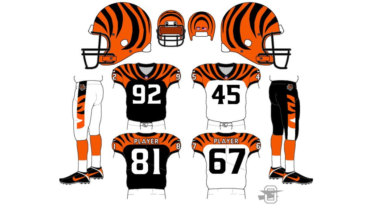
Best Overall Design: Dan Stewart
Lots of the reader-submitted designs included tiger-striped sleeves (which the Bengals already have, of course), tiger-striped collars, and other striped elements. But only Dan Stewart came up with a tiger-striped shoulder yoke. Once you see it, it seems natural and obvious, right? It's surprising that the team hasn't already gone this route. Meanwhile, Stewart's design dispenses with the side panels, simplifies the pants striping, and uses a sensible number font. Here's hoping the team goes in this direction soon.
Best Helmet Tweak: Brandon Moore
Sometimes a small adjustment can go a long way. That's the case with Brandon Moore's proposed helmet design, which streamlines the tiger stripes so they look more like bold accents instead of abstract squiggles. The orange facemask might be overkill, but the shell design is first-rate.
Best Socks: Colin Eadie
Despite their longstanding striped motif, the Bengals have never had tiger-striped socks. Colin Eadie's concept addresses that oversight quite nicely. (Honorable mention to Ethan Dimitroff, who came up with something very similar.)
Best Logo: Sergio DaSilveira
Maybe we're getting a bit carried away with the tiger striping, but Sergio DaSilveira's striped football, which he proposes using as a midfield logo, really works! Simple and effective—sometimes that's all you need. (Honorable mention goes to Chris Glover for his cartoon tiger mascot.)
Most Interesting Use of Striping: Christopher Noice

Christopher Noice took a more subdued approach to the tiger motif, running short horizontal stripes up the sides of the jersey and pants. It's not completely successful, but it hints at greater possibilities—intriguing! (Honoroable mention to Adam Cain, who used the tiger striping to spell out "Cincinnati.")
Most Interesting Color Choice: Ted Outerbridge
Why so much green in Ted Outerbridge's designs? "It’s hard to watch a Bengals game on TV without noticing the illustrations of green vegetation along the padded walls that line the field, mimicking a jungle atmosphere," he says. "Because of this, I've always associated green with the Bengals. Green represents the habitat and hunting grounds of the Bengal tiger, so the players will look through a green facemask, just as a tiger would through the tall jungle grass." There may be a bit of apple-polishing at work here (the Uni Watch judging panel is well-known for its love of the color green), but you have to admit it's an interesting approach, and one of the few entries we received that didn't rely on the default color scheme of orange, black, and white.
And there you have it. Want to see more? You can check out all of the design entries we received here. We'll do more design challenges soon, and next time we'll be sure to choose a team that everyone agrees is overdue for a facelift. Looking at you, Tampa Bay Buccaneers!
Paul Lukas has been covering the uniform scene for 20 years. You can read more of his uniform writing on his Uni Watch Blog, plus you can follow him on Twitter and Facebook. Want to learn about his Uni Watch Membership Program, check out his Uni Watch merchandise, or just ask him a question? Contact him here.