Which NFL Throwback Uniforms Should Make a Comeback?
We're back with another Friday roundtable. Throughout the summer we've talked about a few new things: New expansion cities, new players, new franchise cornerstones. This week we're going old school. Here are some great unifoms of seasons past that we'd like to see come back.
Oakland Raiders
In 2009 the Raiders and Chargers celebrated the 50th anniversary of the AFL with throwback uniforms, and while the Chargers whipped out the powder blues that we’re all accustomed to, the Raiders’ ensemble was something special—silver numbers with black trim, and a two-toned logo on the helmet. They only used that logo for one year, in 1963, opting for the more streamlined current logo from ’64 on. One man’s humble opinion: Go back. Upon moving to Las Vegas, use the uniforms to harken back to a decade when Vegas was new and enchanting and violent. Use the ’63 logo and the black trim on the away jerseys and never look back. —Robert Klemko
Philadelphia Eagles
Kelly green is superior to midnight green, and I can’t be swayed. The Eagles have been working to bring back the kelly greens as an alternate jersey for three years now, but the hold-up is that the NFL does not allow players to use multiple helmets, and the team’s current midnight green helmets clash with kelly green. The obvious solution is to go back to kelly green full-time. The fact that the franchise won its first Super Bowl in the midnight greens might be a deterrent to some, but I’ve never loved the dull teal-ish hue. Plus, ’80s fashion is hot right now. —Jenny Vrentas

Walt Disney Television via Getty
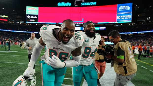
Miami Dolphins
Here’s a little secret: Growing up in Massachusetts in the ’80s, I don’t remember there being many Patriots fans in my elementary school. They weren’t just bad back then; they were a James-Dolan-running-the-Knicks level trainwreck, without any of the historical advantages playing at the Garden gives Dolan’s team. So everyone who rooted for the Celtics, Bruins and Red Sox had some out-of-town team in the NFL they liked. For a lot of kids whose families were rooted in the area back a few generations, that team was the Giants, who were Boston’s NFL team before the AFL Patriots joined the NFL in 1970. Those whose families weren’t as ingrained in New England picked other teams for random reasons. And in the era of the quarter-zip Starter jacket, a lot of times, those reasons included the team’s colors and uniforms. The Raiders and Cowboys scored points in that area, and so did the Patriots’ AFC East rivals from Miami.
Oakland and Dallas never changed their look. Inexplicably, for whatever reason, the Dolphins did. It started with “modernizing” the fish on the helmet and adding drop shadows to the numbers in the ’90s, and got way worse this decade with the team trying, and failing, to meld its history with Phil Knight’s Oregon. So for me this question has a simple answer: Bring back the old Dolphins uniforms from the ’70s and ’80s. I don’t care which iteration. Just bring ’em back. Every time the Dolphins put those on, the reaction is swift and seems unanimous. Which should make this one academic for the powers-that-be down there. —Albert Breer
Tampa Bay Buccaneers
The Tampa Bay Buccaneers knew they had to make a bold statement when they joined the league in 1976. What better way to stand out than with the most flamboyant uniforms in NFL history—a creamsicle orange-and-white color scheme, and helmets featuring Bucco Bruce, the Errol Flynn-inspired, plume-hatted swashbuckler with a blade in his teeth and a piratical gleam in his eye. Over the years critics blamed the uniforms and logo for the Bucs’ on-field performance, but Lee Roy Selmon and Hardy Nickerson did just fine in the get-up, and Tampa Bay went to the playoffs three times in four seasons from 1979 to ’82, with Doug Williams at quarterback. (Might their plummet in the ensuing years have been due not to the color scheme, but to the team’s decision to low-ball Williams on a contract and push him to the USFL in 1983? Or, a few years later, to trade away Steve Young?) After the Glazers bought the team, the Bucs switched to the pewter-and-red scheme with a crossed-swords emblem for the 1997 season, looking for a karmic change. It worked—for a while. But the Bucs have been to the playoffs only twice since their Super Bowl season in 2002. Time for another shakeup. Besides, who doesn’t like a creamsicle? —Mark Mravic
New England Patriots
The Patriots’ current uniforms look like what people in 1989 thought football uniforms would look like in 2019, when we were all supposed to be driving, living in, and eating hover cars. (Stop dragging your feet on the edible car, Musk!) The fact that a franchise won six Super Bowl titles while dressed like that is a shame we, collectively, will never live down. It's time for a return to the Pat Patriot reds. Even if you disagree with the objective fact that the Patriots’ current uniforms are atrocious, going back to red allows them to stand out in a league where approximately 29 of the 32 teams wear some shade of blue. And, of course, the helmets pay homage to a time when Americans slapped on tricorne hats, furrowed their brows and defeated the British, winning freedom for a nation as well as the right to call their sport “football” while re-branding the kicking one “soccer.” —Gary Gramling

Focus on Sport/Getty
Cincinnati Bengals
I think the Bengals should go back to the helmets that say BENGALS on them. Maybe this is a reflection of my general take on uniforms—I preferred the Giants helmets that said GIANTS and the Jets’ helmets during the late ’80s and early ’90s. Their current setup feels like it’s passed the expiration of coolness. Back when it was revealed, I'm sure it was wild. People thinking, "Man, I can't tell the difference between these stripes and the stripes of a real Bengal tigers.” It feels very Zubaz to me, which would be great if the Bengals had stopped using the stripes, then brought them back amid this endless cycle of nostalgia. However, they missed that opportunity and now just need to do something—anything—different. —Conor Orr
Houston Oilers
There’s one uniform we should see on an NFL field, at least occasionally, but it seems we never will. We need to step in and save the classic Houston Oilers baby blues. But, to be clear, we should see them in Houston. The reason I have to give this clarification? Right now the Oilers’ logos, uniforms and trademarks are owned by the Tennessee Titans, who were originally the Oilers before they moved in the ’90s.
Texans players are pining for the jerseys. JJ Watt has tweeted about it, Deshaun Watson has worn one, Deandre Hopkins has posted a photo of himself in one in on Instagram. But Titans owner Amy Adams Strunk—daughter of Bud Adams, the late owner who oversaw the team’s move from Houston to Tennessee—has already said it won’t happen.
I understand that in 2019 everyone wants to claim and hoard all the financial assets they can. That we live in a world where Zion Williamson can blurt an innocuous phrase at his introductory press conference and both he and his team can race to trademark it. That nowadays anything worth a buck is apparently worth filing for dozens of trademarks over and hiring vast teams of litigators to spend years fighting for. But this situation just … kinda … sucks for everybody. These uniforms mean nothing to people in Tennessee. (Well, they mean something to anyone with good fashion sense and an appreciation for aesthetics, but no more to anyone in Tennessee than they mean to people in Ohio or Idaho or Delaware.) But they mean a lot to many fans in Houston. It really, really sucks that diehard fans in Houston who grew up on the Oilers can’t buy Oilers gear without literally enriching the family that moved the team, but here’s the Oilers gear on the Titans’ website. Imagine how much more unconscionable that would feel if the city of Houston hadn’t been lucky enough to get an expansion team in 2002.
The Adams family is worth more than a billion dollars. The Titans team is worth more than two billion. Just let Houston’s football team wear the cool jerseys once a year. Nobody’s going broke over it, and people might actually appreciate the gesture. —Mitch Goldich
Buffalo Bills
In 2011 the Buffalo Bills updated their uniforms with a look that takes you back to the ’70s and early ’80s (and away from the weird phase from 2002-10 when the team inexplicably incorporated more navy blue than it should have). But one aspect of the Bills’ old uniforms that I would love to see come back is the helmets from 1962-1973—white with a red-and-blue stripe down the middle, and a red buffalo on either side.
Upon first glance at this helmet design, the red outline of the buffalo doesn’t look all that intimidating, especially when compared to the current design of the blue buffalo with the red laser beam coming out of its eye. But think—if you happen to be walking along a path, and you come across a buffalo just standing in your way, you would be terrified. The intimidation factor isn’t immediate, but oh, it’s there. —Bette Marston

Neil Leifer/Sports Illustrated
The Refs
It feels like referees have been called zebras since the beginning of time, but there was a period of five years, from 1941 to 1946, where the officials strayed from the black and white striped uniform, and took on three additional color-combos: red and white striped, green and white striped, and mustard yellow and white striped. Even the knee-high socks included the two colorful stripes at the top! Multi-colored ref uniforms—what a world! Referees wore black and white with red uniform numbers, umpires wore red, head linesman wore yellow, and field judges wore green. The NFL should bring these color-coded unis back for a little bit of excitement. —Kalyn Kahler
• Question or comment? Email us at talkback@themmqb.com.